Challenge
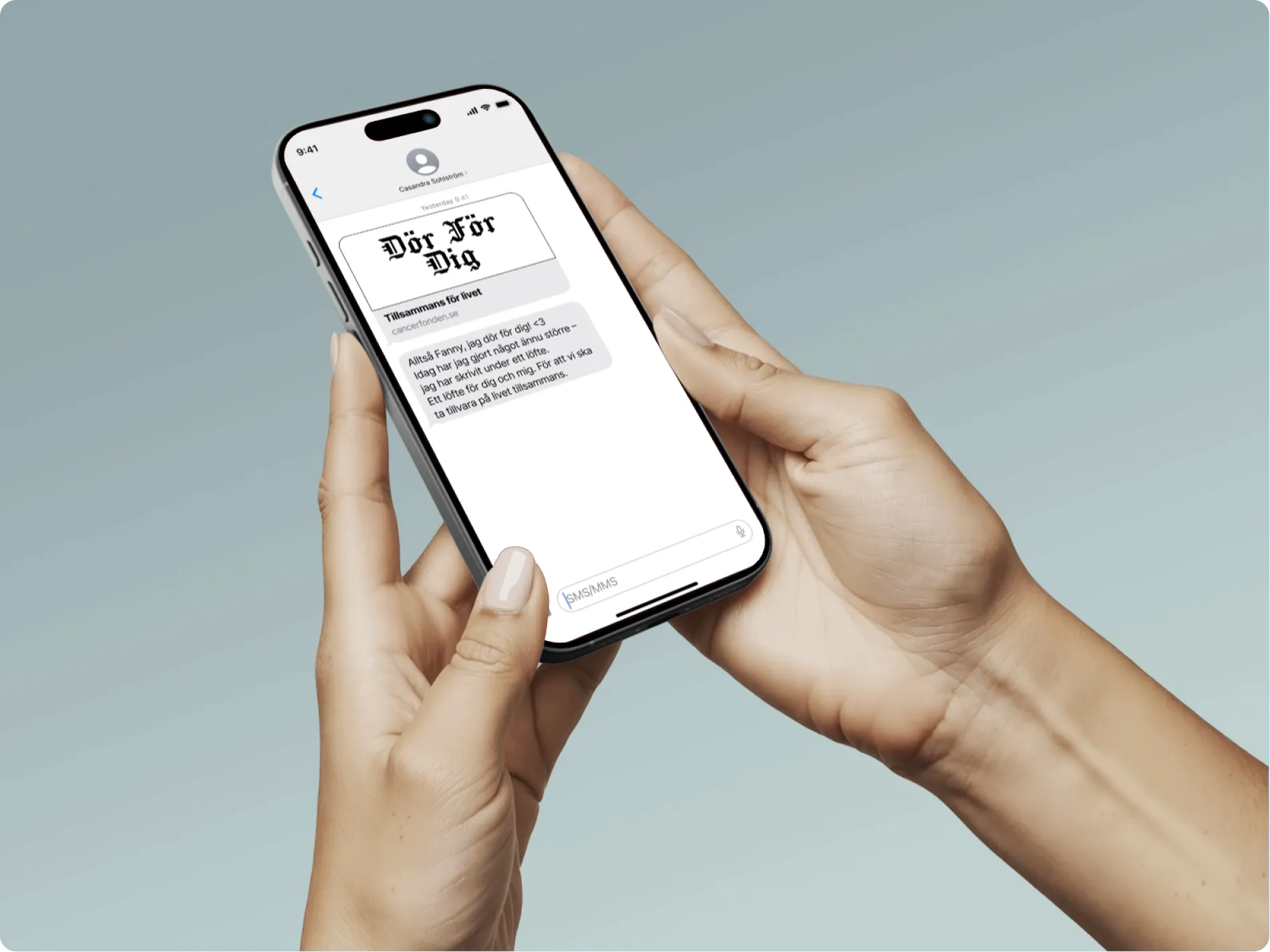
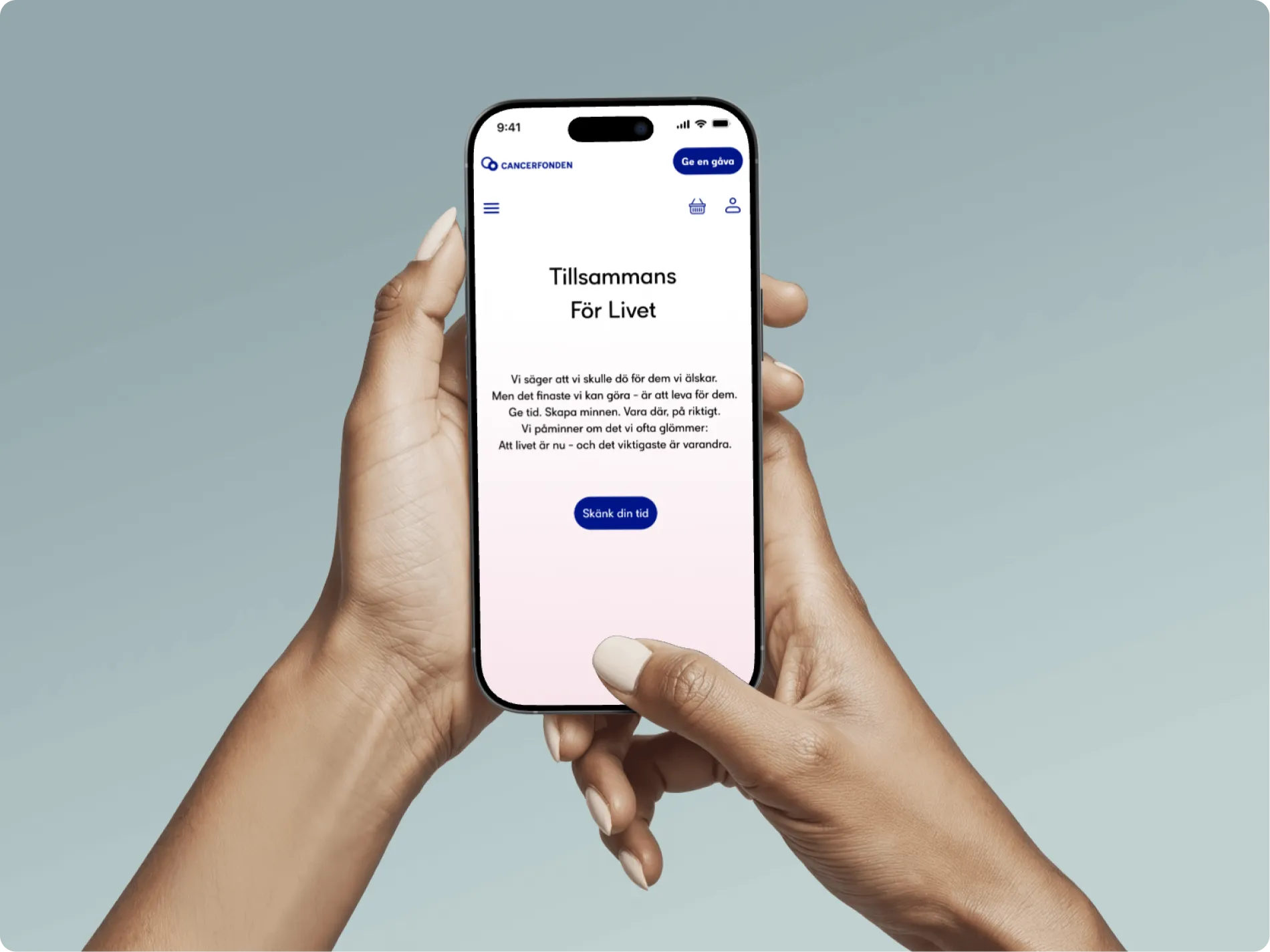
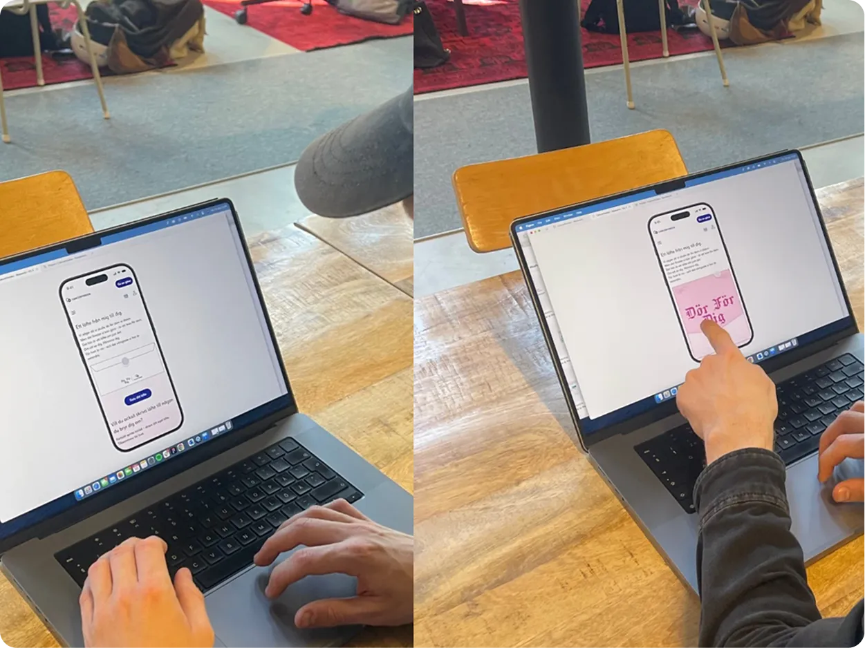
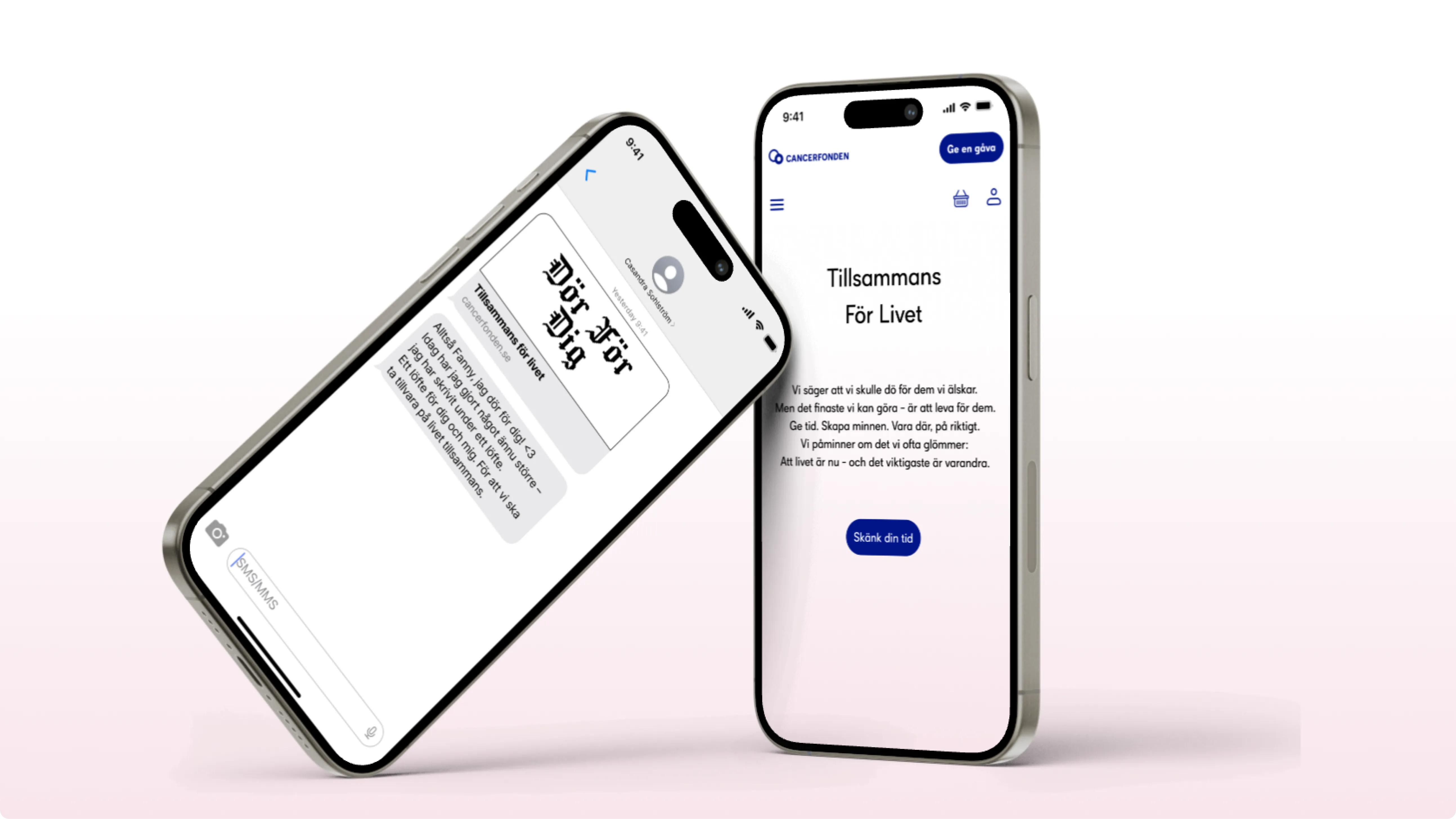
Cancerfonden’s communication was trusted but often felt distant to younger audiences. The challenge was to make the message more relevant and emotionally accessible for Gen Z; a generation that values authenticity, speed and connection.
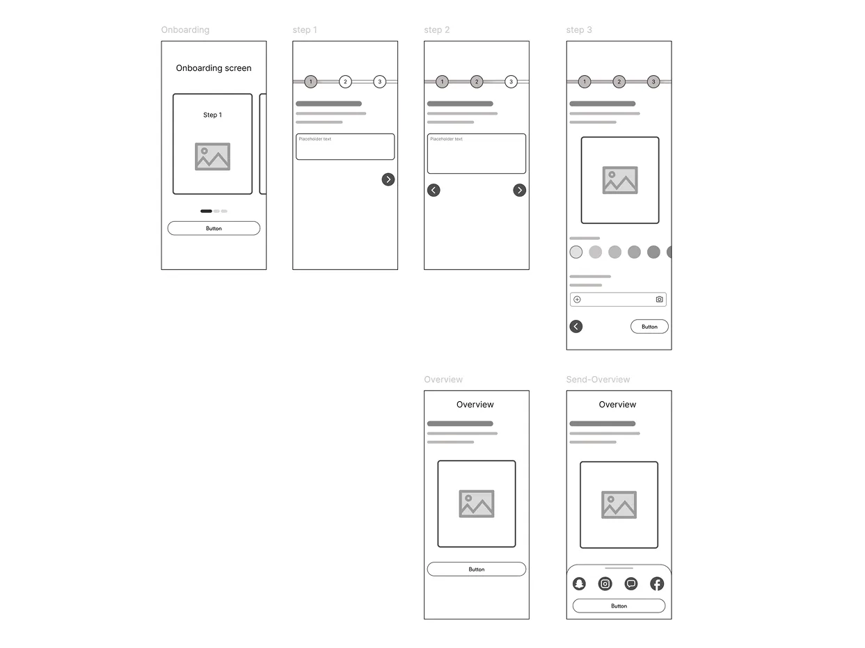
The goal was to design a digital campaign experience that felt personal, shareable and engaging, while avoiding the tone of traditional charity communication.
The goal was to design a digital campaign experience that felt personal, shareable and engaging, while avoiding the tone of traditional charity communication.