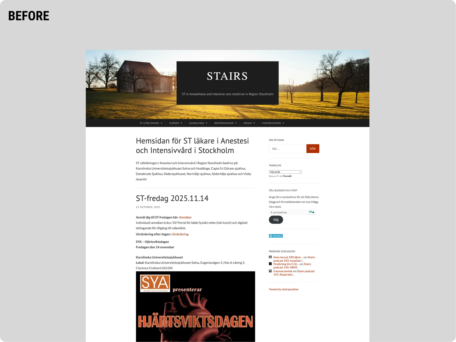
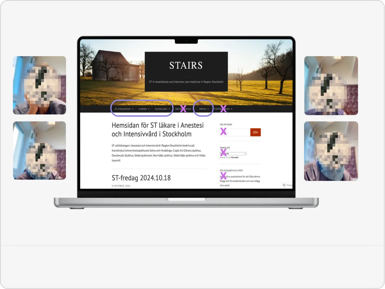
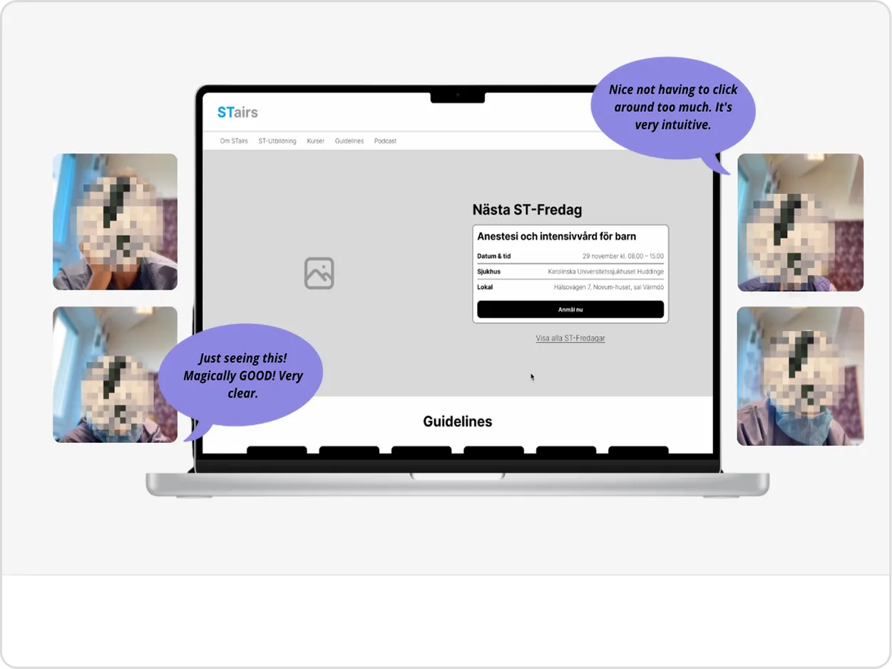
STairs – Karolinska Universitetssjukhuset

STairs is Karolinska Universitetssjukhuset’s digital learning platform for ST doctors. The tool is essential for supporting medical specialists throughout their training — yet the platform felt outdated, slow to navigate and difficult to use. The project aimed to modernise the experience and create a more intuitive, structured and supportive learning environment.
UX/UI Design
UX Research
Information Architecture
User Testing
Laptop mockup displaying the redesigned STairs medical education platform homepage with updated hero section and course navigation.

Challenge

Users often struggled to find what they needed, complete tasks efficiently and understand where they were in the process. Content was buried in deep structures, workflows were unclear, and the overall interface lacked hierarchy and guidance.The challenge was to reduce cognitive load and design a platform that felt faster, clearer and easier to navigate — without changing the core functionality.
Before-version of the STairs medical education website, showing the original homepage with blog-style layout, heavy text blocks and outdated navigation.After-version of the redesigned STairs education platform homepage, showing updated hero section, course overview and improved UI for medical training content.

Insight

Through interviews and heuristic evaluations, it became clear that ST doctors were not lacking information — they were overwhelmed by it.

They needed a platform that:
• Prioritises clarity over volume
• Reduces friction in daily tasks
• Gives a better overview of progress
• Matches the expectations of modern digital tools

This shaped the direction towards a clean, structured and clinically calm user experience.

Process

Research: Conducted interviews, gathered insights from ST doctors and mapped pain points across the existing platform.

Structure & Flows: Reorganised navigation, simplified hierarchies and clarified user journeys to reduce unnecessary steps.

Wireframes: Built low-fidelity concepts focusing on clarity, overview and simplicity.

Design System & UI: Created a modern, accessible interface with improved spacing, contrast and consistent components.

Prototype & Testing: Validated flows and UI with users, refining layout, copy and interactions based on feedback.
UX interview with an ST doctor in an office environment.UX/UI designer (Casandra) creating whiteboard wireframes for the STairs healthcare education platform during an ideation and structure workshoPersona for the STairs medical education platform redesign, showing a specialist training physician with goals, needs, concerns and useful features.User testing of the original STairs website, showing participant reactions around a laptop displaying the old interface with highlighted navigation issues.User testing session for the redesigned STairs platform, showing participant reactions and feedback displayed around a laptop with the new layout.Jobs-to-be-done overview for the STairs platform redesign, showing user journeys before and after for key tasks such as registration, finding guidelines, listening to podcasts and signing up for courses.

Solution

A redesigned platform structure with clear navigation, task-oriented workflows and a visual system that supports concentration and guidance. The new interface emphasises hierarchy, readability and accessibility — creating a calmer and more intuitive experience for busy doctors. Reusable Figma components and documentation made the solution scalable for future features.

Result

Early testing showed improved task completion, reduced confusion and a much stronger sense of overview. Users described the new design as “clear”, “structured” and “much easier to use”. The design has laid the foundation for a more modern and efficient platform that better supports medical professionals in their daily learning.
"Perfect, you've really managed to include the most important parts. This was exactly what we needed, thank you"
Laptop mockup showcasing the new UX/UI design for the STairs anaesthesia and intensive care education platform, featuring the improved hero layout and quick-access modules.

Reflection

STairs reinforced the importance of clarity in complex systems. When users are under pressure — as in healthcare — every interaction must reduce friction, not add to it.Thoughtful structure, accessible UI and consistent components proved essential for creating a platform that feels trustworthy and supportive.

team

Casandra Sohlström
Hampus Larsson